
.jpg?width=68&height=68&name=Brian-Headshot%20(2).jpg)
Contemplating your conference website design but not sure where to start? We’ve got you covered.
If you’re feeling a little lost when considering your conference website design, you’re not alone. We work with hundreds of meeting planners at Ex Ordo and we know that designing your website can leave you wondering where to begin. You know this as well as we do, it begins at what are your event’s objectives? Every detail—from social media posts to conference website design—should align with the answer to this question.
Your conference website design
Whether you’re planning a local, national or international meeting, your site is your digital shop window. And it needs some careful thought so that it can effectively promote your event. Your conference website can be a powerful tool to tackle key challenges, such as:
- Attracting sponsors
- Building credibility
- Encouraging participants to travel in a post-pandemic world
- Boosting registrations and submissions
First up, if you’re a meeting planner within a membership association, it’s important to create a clear distinction between your association website and your conference website. The first site should act as a focal point for your members, and promote your organisation’s work across advocacy and education. On the other hand, your conference website should be squarely focused on showcasing your event and converting visitors into attendees. But regardless of whether your conference website is a microsite within a larger organisation website or it’s flying solo, it should be easy to use.
In fact, the best conference websites take the hand of attendees to guide them towards submitting and registering. So, whether you’re a tiny non-profit using a readymade Squarespace site, or you’ve got the budget to build a website from scratch, use this guide to create a conference website design that works for your audience. There are many conference apps that can help you too.
Outline what content your conference website needsFirst up, outline the pages you need to include in your site design. If you’re hosting something bigger than a local chapter meeting, you’ll probably need at least some of the following.
1. Location
Including the venue, address and instructions on how to get there. Add a Google map, and give visitors info on public transport and parking. If your meeting is international, you’ll need instructions for overseas delegates on things like visa policies and airports.
2. Keynote speakers
Speakers play a vital role in making up the minds of your conference website visitors, so give them visibility. List speakers and add their bios, headshots and links to their social profiles. (But set a strict word limit so you don’t end up with bios the length of War and Peace.) Include brief bios for all confirmed speakers and links to their research, profiles, or social media.
3. Abstract management software
If you’re a scholarly society, your conference website will also be responsible for collecting abstracts or papers from authors. You’ll need to include a link to bring authors to user-friendly abstract management software like Ex Ordo. Help them along by including instructions, topics, formats deadlines and a description of your review process(briefly explain how abstracts will be reviewed and selected).
4. Organising committee details
Including your organising committees on your conference website is a good way of giving these volunteers some recognition. But it will also help earn your web visitors’ trust. For non-members unfamiliar with your event, seeing that respected people in their field are involved can help demonstrate the quality of your conference programme.
5. Registration info
Your registration page should contain clear instructions on how to register. Think: deadlines, how much it costs, payment methods and any T’s & C’s. Clearly describe ticket types, fees, and what each ticket includes (e.g., meals, access to special sessions). Outline any early-bird pricing, student rates, or group discounts.
6. Contact details
Include a dedicated contact page that lists which people to contact in relation to what. For example, the programme chair, registration chair, and sponsorship contacts. Where possible, include phone numbers, so people can reach them in an emergency.
7. Schedule
Delegates will want to study your sessions in advance, and a strong schedule may attract last-minute registrations. So include links to a detailed schedule in your conference website design, offer a breakdown of sessions by time, topics, speakers, and room locations.. Mention networking sessions, workshops, or social events.
8. Sponsors
Don’t forget to allocate space to your sponsors when designing your conference website. At the minimum, they’ll usually want their logo along with a link to a relevant page on their websites. (If you can, recommend they create a specific page – aka a landing page – especially for your conference attendees.). Outline sponsorship tiers and benefits.
9. Conference history
If your meeting has been running for years, include a page on your website telling the story of the conference: when it was created, key milestones, and some statistics. This helps show how your event has evolved over time and gives you an opportunity to build your conference’s reputation.
10. Why attend
A simple page outlining what’s unique about your event and what delegates can expect to gain from attending will do.
11. Frequently asked questions (FAQs)
Adding an FAQ page to your conference website can save your visitors from having to search for the answers to common questions. (And will also save you from answering extra emails in the run-up to your event). Cover details about registration, accessibility, session access, and event app usage.
12. Conference goals and themes
Explain the conference’s purpose, target audience, and specific themes.
Map your site structure early in your conference website design process
As a meeting planner, you know your audience better than anyone. So put yourself in their shoes when putting together your conference website design.
List all the actions you want them to take like submitting their abstract, viewing your speakers list or registering. Then tie these actions into their needs. What info will they need in the moment? What questions might they have before they take action? Don’t limit yourself to members already familiar with your event, consider all the different types of visitors your website will get: like non-members, authors, delegates, potential sponsors, etc.
Once you’ve done this, you can map out the journey you want visitors to take. (A typical delegate’s journey could be: Homepage > Submission page > Abstract management software > Confirmation page.)
Once you have a clear idea of the main paths, start wireframing your conference website structure. You could think of using a web hosting platform but your site structure should be logical and simple, with no more than seven main categories. The most important pages of your website should be easy to find. Your website structure might look something like this:
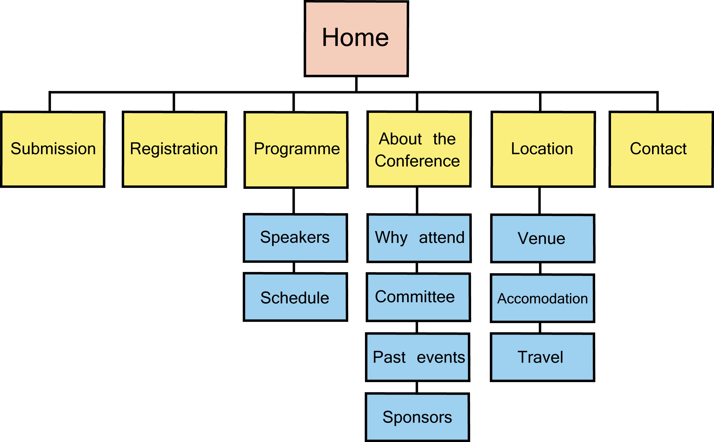
A common website structure we see on Ex Ordo conferences
Wireframe the structure of your most important webpages
When designing your conference website, it’s useful to have a basic understanding of how the average person uses a website. A study by Nielsen Norman Group found that the majority of web visitors read in an F pattern.
What this means is that most of us first scan the top of a webpage horizontally, then we move down the page and read across in a second horizontal movement. Finally, we scan the left side of a page in a vertical movement.

An example of the F pattern most web visitors use
Keep this in mind when you’re deciding where to display the most important info on each page. Got important details about an upcoming submissions deadline? Don’t hide it towards the bottom. Want to include easy-access buttons for submitting, registering or viewing your schedule? Give them priority in a menu on the left.
Design clear calls to action for your conference website
A “call to action” is a prompt on a webpage that tells visitors to take a specific action – whether that’s submitting, registering or viewing your schedule. And in the words of association-website experts, Mighty Citizen, “ It’s very difficult to have multiple calls to action (CTAs) that are equal on every page. If you’re trying to say everything, you’re really saying nothing. Every page of your website is responsible for a unique goal. “. A reliable website builder lets you create a professional site easily, no coding needed.
The same rule applies to designing your conference website. If you overwhelm visitors with multiple calls to “submit now” “check out the schedule” and “register today” on each page, you’ll bamboozle them.
Instead, think carefully about which call to action should sit on each page. Then give it pride of place near the top. Here’s an example of the American Geophysical Union’s fall meeting microsite, complete with a “submit now” call to action on the homepage. You could use some promotional products to help drive traffic.
Spend time priming your website for search engine optimisation (SEO)
Don’t make the mistake of thinking that once your conference website goes live, that visitors will magically flock to it. You’ll need to optimise your website so that search engines like Google can find it first
Do your homework on which keywords to optimise for (use a free keyword research tool to help). By understanding what keywords to target you can ensure the authors you want to submit and attend your conference can easily find your website.
To help with SEO, make sure your URL and homepage title match, and that your conference dates are clear. Then ask your members and keynote speakers to link to your website from theirs, and share your link on social media. This can make a massive difference in where your website ranks in search engine results.

7 Quick-and-dirty conference website design tips
Sometimes a few small tweaks to your conference website design can make a big difference .
1. Make sure it’s optimised for mobile
As of the middle of 2018, 51.89% of all global web traffic was from mobile devices. And your site will be no exception. Make sure that when visitors browse your conference website on their mobile device, the design looks and works ok.
2. Keep Navigation Simple
Make it easy for visitors to find essential information with a clean menu and key CTAs, like “Register,” “Submit,” and “Agenda,” right at the top.
3. Add conference name and dates as text at top of every page
Add your event’s name and dates to the header of every page. But make sure it’s displayed as text, not an image. This helps search engines push your conference up the search results.
4. Give big-name speakers pride of place on your homepage
If you’ve managed to snag some big-name speakers, give them pride of place on your homepage. They’ll have serious pulling power, so flaunt ‘em.
5. Don’t forget to add social media buttons to your conference website design
Authors and delegates want to make sure your conference is worth attending. And social proof – the power of honest opinions – is one of the most persuasive ways to convince them. So don’t forget to include social media buttons on your website. These can help encourage visitors, delegates and everybody involved in your conference to interact on platforms like Twitter and Facebook to help promote your conference.
6. Add videos and testimonials from past events
Consider adding simple, interview-style videos with your chair or keynote speakers to your conference website. Or create a montage of clips from last year’s event. Video is well documented as an effective marketing tactic and it’s a great way of offering members and non-members alike a teaser to pique their interest in your congress. Or, if video is beyond you, pick the best testimonials from last year’s delegates, and promote them on your website.
7. Use High-Quality Visuals
Invest in a few high-quality images or graphics to make the site more engaging. Simple but appealing visuals can make the site feel more professional and attract sponsors and attendees alike.
Conclusion
Even if you create the world’s most beautiful conference website design, if you pair it with clunky software that frustrates would-be authors or makes it difficult for people to register, your conference will miss out. So make sure you pair your conference website with a flexible conference management system like Ex Ordo.


%2016.27.03.jpg?width=1200&height=800&name=Conference%20attendees%20(1)%2016.27.03.jpg)