
.jpg?width=68&height=68&name=Brian-Headshot%20(2).jpg)
Conference badges are an important networking tool – stop wasting money on badge designs that don’t work.
“I’ve spoken at hundreds of conferences in the course of my career and the one thing that most of them have in common is crappy name badges.” So writes Brian Fitzpatrick, former Googler and regularly peeved conference presenter.
Why are conference badges important?
I’ve been fortunate to attend many conference(and organise one!), I’ve lost count on the number of conference badges that completely limit engagement, connection and networking at those events. Whether it’s tiny writing or unnecessary clutter next to the name, too many time we have seen people squinting their eyes trying recognise a name on a conference badge. We know a huge part of any research or academic conference-going experience is meeting new contacts and reconnecting with old ones. But here’s the thing: most of us aren’t naturally gifted at networking. We forget people’s names, or which university they’re from. We have trouble remembering a face outside of its usual context.
And when that happens and the person’s striding towards you, hand outstretched, we often rely on their conference badge to help us sidestep an awkward moment.
Nice one, badge!
But sadly, the average name badge at the average research conference isn’t winning any prizes. Instead of clear and helpful badges, we get names printed in minuscule type, badges positioned so that you’re forced to stare surreptitiously at someone’s chest, badges that add no context to a familiar name.
As mentioned conference badges are important for several reasons:
Identification
They allow attendees to quickly identify each other, which is essential for networking, security, and event management. Badges often display the attendee’s name, affiliation, and role, helping people make relevant connections.
Access Control
Badges can indicate different access levels, such as for speakers, VIPs, or exhibitors, ensuring that people are in the appropriate areas of the event.
Branding
Badges offer an opportunity to showcase the event’s branding, sponsors, or themes, adding to the overall professional look of the conference.
Icebreakers
They often serve as conversation starters, helping attendees to connect with each other based on shared interests or organisations.
Personalisation
Customised badges enhance the attendee experience by making them feel recognised and part of the event community.
Role and Access Clarity
Badges indicate specific roles (e.g., speaker, organiser, or sponsor), guiding attendees on whom to approach for different needs, further enhancing networking opportunities.

The list of crimes against the average conference name badge goes on. And on. And on.
If you’re considering spending part of your precious conference budget on name badges, ask yourself how they’ll make your conference an easier space to navigate. Are they going to help delegates realise they have common interests? Jog memories? Connect with the conference more? Be a talking point?
Brian Fitzpatrick recognises the huge potential stored within a well-designed conference badge (and how far short of this the average conference can fall), so he co-founded Badge Reviews which comes with a handy rulebook for name badge design. We’ve adapted these rules below.
Your conference badges should…
1. …Display delegates’ first names nice and big
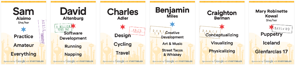
Image: Marcin Wichary
To boost visibility and help jog memories, delegates’ first names should be nice and large (72pt minimum). While the last name should be large too, it doesn’t need to take equal weight.
Designer and typographer Marcin Wichary gives a good breakdown of how to deal with long and short names in badge design.
2. …Be Legible at 4.5 metres (15 feet)
Four-and-a half metres (15 feet) is your target for readability. Print your conference badge and try reading it from this distance (and in various lights).
If it’s not easily legible, go back to the drawing board. It can be agonising when you’re talking to your fellow delegates at a conference and you’re faced with a minuscule conference badge.
3. …Include a conversation-starter
Image courtesy of Tito. (But maybe ask about their research interests instead of their favourite fictional character…)
Before the conference, ask delegates to provide you with two or three research topics they’re interested in. Add this to their name badge (and make sure it’s big enough to read from a distance).
As the guys at Badge Reviews say: “This gives folks an excuse to look at someone’s name and create talking points.” Conferences act as real-life social networks and having two or three topics of interest on your conference badges can help build bonds between researchers at your event.
4. …Be quite big
When it comes to conference name badges, bigger is better. A larger badge gives you an opportunity to include details in clear writing making it visible across a crowded hallway. Look for badges that come as 10 cm x 15 cm (around 4” x 6”) as standard.
5. …Use a clear font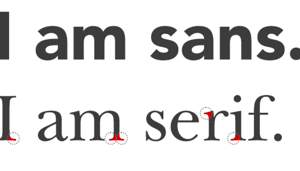
Image: Shy Fonts
Your badge font should be readable at a glance, so go for a simple, sans-serif font.
As Clint Neuerburg, Art Director for Access, says: “Fonts like Helvetica and Gotham are ubiquitous for a reason; they maximize legibility for a small amount of information to be read quickly at a distance. You can get tricky with more stylized sans-serif fonts, but we keep returning to the basics because they work and fit with nearly every design.”
6. …Have a small logo and conference title
“Use the real estate you’ve got for the most important information,” advises Stephen Heard in his post Conference name tags mostly suck.
Your conference branding may be a work of art, but delegates already know where they are. (And if they don’t, you have bigger problems than name badges to deal with.) So make the research conference logo and title small and put them at the bottom.
And don’t include conference dates or location. “If you shrink or lose the useless ornamentation, you’ll have room for my name in a nice big font – plus maybe some other useful stuff,” says Stephen. This could include delegates’ affiliation, Twitter handle, or even the venue’s wi-fi code.
7. …Not flip over
A familiar face is approaching you in the hallway, they gave a great presentation earlier today…but what’s their name again? You eyeball their badge, but it’s flipped over and is coming up blank. Just like your memory.
Invest in conference name badge holders that don’t flip. Look for lanyards that connect to two holes in the top corners of the holder. (And if you can’t stop them flipping over, print them double-sided.)
8. …Be adjustable (and comfortable)
Delegates come in all sizes; your lanyards should too. Make sure your lanyards are adjustable to avoid awkward positioning (and subsequent awkward glances). They also need to be comfortable enough to wear around for a whole day, or delegates will ditch them as soon as they get the chance.
9. …Not sacrifice function for form
Imagine trying to make out that name as the person strides towards you
Steer clear of quirky design that comes at the expense of practicality. Lovely designs are great, but if you need to choose between badge design and functionality, choose functionality every time.
Your research conference badges should help delegates strike up conversations, don’t let a flashy design get in the way of that.
10. …Be an investment
It can be tempting to go for the cheapest options out there. But a good badge and holder will help ease your delegates into networking situations. So treat them as an investment: spend a little money on them, and have volunteers collect holders and lanyards at the end of the conference to reuse again next year. (Or consider getting your badges sponsored as part of a conference sponsorship package.)
Conference badges are an important networking tool
Good conference badges help create networking opportunities for delegates. And creating optimum conditions for networking is the kind of thing that’ll have delegates registering to attend again next year.
Further reading on conference badge design
- Adrian Segar gives some good advice in Anatomy of a Name Badge.
- Stephen Heard takes organisers to task in Conference nametags mostly suck.
- Brian Fitzpatrick’s Ten Rules for a Better Conference Name Badge gives badge advice to live by.
- Marcin Wichary dives into design rules in Name badges, the unsung conference heroes.
- Check out the reviews on Badge Reviews.
- Have a gander at the sample of conference badges Tito has collected.
- Check out this free conference badge generator which even comes with a QR code. Bam!


